Overview
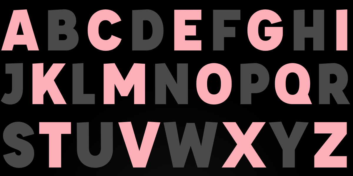
For decades, web designers have dreamed of a ::nth-letter CSS pseudo-selector—a feature that would allow targeting individual characters within text for stunning typographic effects like drop caps, color cycling, or kinetic letter animations. Despite community requests since 2003, no browser has implemented it. But don't despair: we can simulate similar results using JavaScript, clever CSS, and polyfills. This tutorial walks you through three proven methods to achieve letter-by-letter styling today, complete with code examples, pitfalls to avoid, and a summary of best practices.
Prerequisites
- Basic understanding of HTML structure (elements, attributes)
- Intermediate CSS knowledge (selectors, properties like
transform,background) - Working knowledge of JavaScript (DOM manipulation, loops)
- A text editor and browser (Chrome, Firefox, or Safari recommended)
- Optional: familiarity with polyfills and CSS Houdini
Step-by-Step Guide: Simulating ::nth-letter Effects
Method 1: JavaScript Auto-Wrapping (Most Flexible)
The most reliable approach is to use JavaScript to automatically wrap each character in a <span> element, then target those spans via CSS. This gives you full control over odd, even, or custom letter indices.
Step 1: HTML Setup
<h1 class="fancy">Hello World</h1>Step 2: JavaScript to Wrap Letters
function wrapLetters(selector) {
const elements = document.querySelectorAll(selector);
elements.forEach(el => {
const text = el.textContent;
el.innerHTML = text.split('').map((char, i) =>
`<span class="letter letter-${i}">${char === ' ' ? ' ' : char}</span>`
).join('');
});
}
// Usage:
wrapLetters('.fancy');Step 3: CSS Styling with :nth-child
.fancy .letter {
  display: inline-block;
  padding: 20px 10px;
  color: white;
}
.fancy .letter:nth-child(even) {
  transform: skewY(15deg);
  background: #C97A7A;
}
.fancy .letter:nth-child(odd) {
  transform: skewY(-15deg);
  background: #8B3F3F;
}
This mimics the original ::nth-letter(odd/even) syntax exactly. The letter-{i} class allows targeting specific positions (e.g., .letter-0 for first letter).
Method 2: Manual Span Insertion (No JavaScript)
If you control the markup and the content is static, you can manually insert <span> tags around each letter. This is tedious but works without JavaScript.
<h1 class="fancy">
<span class="letter-0">H</span>
<span class="letter-1">e</span>
<span class="letter-2">l</span>
<span class="letter-3">l</span>
<span class="letter-4">o</span>
<span class="letter-5">W</span>
...
</h1>Then use CSS like:
.letter-0 { color: red; font-size: 2em; }
.letter-1 { color: blue; }
/* etc. */
For odd/even effects, you could either assign classes manually or use nth-child if letters are direct children.
Method 3: Polyfills and CSS Houdini
In 2026, some bleeding-edge polyfills attempt to extend CSS syntax at runtime. One example is the CSS Polyfill Library (e.g., Philip Walton's abandoned project). While not production-ready, they demonstrate the concept.
<script src="css-polyfill.js"></script>
<style>
h1::nth-letter(even) {
  /* your styles */
}
</style>
Caveat: These polyfills often rely on MutationObserver and can break with dynamic content, cause performance issues, or not work cross-browser. Use with caution.
Alternatively, CSS Houdini's @supports or custom properties could theoretically be extended, but no standard solution exists as of 2026.
Common Mistakes
- Forgetting whitespace handling: Spaces become separate text nodes. Use
|orinnerHTMLtrick to preserve them (e.g., replace space with ). - Applying
display: inline-blockincorrectly: Letters must be inline-block for transforms to work; otherwise, transforms won't apply cleanly. - Not stripping existing whitespace: Original HTML may contain extra line breaks or spaces that break the wrapping logic. Use
textContent.trim()and then join. - Overwriting other event listeners: If you replace
innerHTML, all event bindings on child elements vanish. Use DOM methods likeappendChildinstead if needed. - Expecting native
::nth-lettersupport: Even in 2026, no browser supports it. Don't write pure CSS expecting it to work—always use a fallback. - Performance issues with large texts: Wrapping every character creates many DOM nodes. For long paragraphs, consider limiting to headings or short snippets.
Summary
While CSS has yet to deliver a native ::nth-letter selector, you can achieve stunning letter-by-letter typography effects using JavaScript or manual markup. The JavaScript auto-wrapping method is the most flexible and production-ready, allowing you to target odd/even or specific positions via nth-child. Manual spans work for static content, and polyfills remain experimental. Always handle whitespace carefully and test across browsers. With these techniques, you can create the same effects dreamed of since 2003—no magic selector required.